
How to Optimize Your Nonprofit Donation Form and Stop Losing Donors
There’s a moment that happens every fundraising season.
Someone pulls up the email metrics. Open rate: solid. Click-through rate: decent. Donations: disappointing.
And the question nobody quite asks out loud is: what the heck happened between the click and the gift?
The answer, almost always, is the website or form.
You're Optimizing the Wrong Thing
Most nonprofits treat their campaigns like products and their donation pages like afterthoughts.
The email gets A/B tested. The subject line gets agonized over. The social creative goes through three rounds of revisions. And then the donor clicks through to a donation form that hasn't been touched in two years.
Forms expand over time as teams add new fields to support reporting, segmentation, or future outreach. Individually, each addition makes sense. Collectively, they create unnecessary complexity that confuse and frustrate your potential donors.
It’s time to clean up our forms.
Three Things That Are Quietly Killing Your Conversions
1. Too many fields
Every field you add is a decision point and a potential exit.
The donor came to give, not to fill out a form.
Name, email, gift amount. That's the core.
Everything else is friction you chose to create, and asking for too much information may be one of the most common giving form issues, but it is also one of the easiest to fix.
2. A form that is buried on your page
51% of donation page visitors arrive on a mobile device, and if they have to pinch, scroll, or hunt to find your form, most of them won’t.
A form that wasn't designed for a phone isn't just inconvenient. It's a closed door on more than half your traffic before a single field gets filled out.
3. You don’t have Apple or Google Pay
Think about what you're actually asking a donor to do when Apple Pay or Google Pay isn't available. They're mid-scroll, on their phone, moved by your campaign — and then they have to stop, find their wallet, pull out their card, and type in sixteen digits.
Most won't. Not because they stopped caring. Because the moment passed.
Security concerns and too many steps are the top two reasons users abandon online forms. One-tap payment options like Apple Pay, Google Pay, and Venmo remove both barriers at once. There’s no card entry, no second-guessing, no friction between the impulse and the gift. If your form doesn't offer them, you're asking donors to do more work than they'd have to do buying a coffee.
Five Things to Check on Your Donation Form Right Now
Run through this before your next campaign goes live:
How many fields are required? If the answer is more than five, start cutting.
How does the form load on a phone? Pull it up on your own device right now and see how fast it loads and how easy it is to find.
Is there a specific impact statement above the donate button? "Support our mission" is not an impact statement. "$30 funds Junior Ambassador advocacy training" is.
Can donors pay in one tap? If the only option is a credit card number, that's a conversion problem waiting to happen.
What happens after someone gives? The confirmation page is the most underused real estate in nonprofit fundraising. It should do something like thank, share, invite, upgrade.
The campaign gets donors to the door. The form decides whether they walk through it.
Most nonprofits will spend the next quarter optimizing their emails, refining their asks, and building better campaigns. Very few will look at the page all of that work sends donors to.
That's where the real money is sitting.
If you haven't audited your donation form recently, start there. It doesn't require a redesign or a developer, it requires someone willing to pull up the form on their phone, time how long it takes to load, count the fields, and ask honestly whether the experience matches the campaign that drove the click.
If the audit surfaces a form problem, your fundraising platform is the place to fix it.
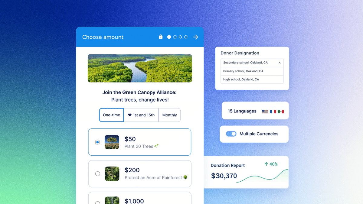
Donorbox’s multi-step donation form converts at an average of 22.6%, several points above the industry standard of 17%, and it comes with one-tap payment options, mobile-first design, and setup that takes minutes, not a developer. Learn more.
